Colours of The Year 2022
The turn of the year sees a raft of companies reveal their ‘colour of the year’. Here in the UK the most widely quoted colour was Pantone’s Very Peri, a completely new lavendery shade, a new move for Pantone. it’s the first time they’ve released a new shade for the promotion in the 23 years since the feature first started. The decision was made as an ode to the ever-changing world we are living in at present. They sure got that right.
Pantone weren’t the only ones though; WGSN a London company who predict fashion trends unveiled that Orchid Flower would be their colour for 2022. Their article featured the headline ‘Color of the Year: Confirmed by Trend and Color Experts, Not a Paint Company’, Someone grab the popcorn.
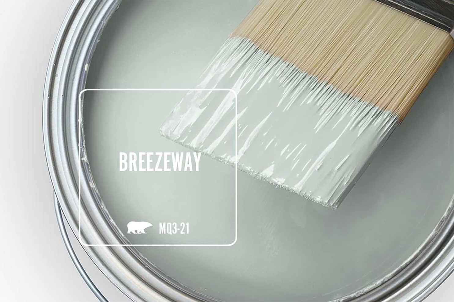
There are literally hundreds of companies now doing the same thing. Far too many to list in full but here’s a flavour of a couple more. US paint brand Glidden's colour of the year is Guacamole, Behr’s picked Breezeway, and Etsy went for an Emerald Green.
See any similarities? No, us neither. And this is where I start to feel uncomfortable with it all. Isn’t why we love design so much because opinions can differ without being wrong. These colour of the year statements seem more like statements of fact. It feels like companies use it as a marketing opportunity to tell us what we shouldn’t be missing out on rather than a sort of ‘How cool is this colour, we just like this at the moment’.
My hesitation with this tradition shouldn’t be confused with a non-acceptance of trends. I completely get that there are trends that will come and go over time, chair bows have had their day about 15 years ago, but these colours don’t feel like trends as they are all so different. Incorporated with the correct styling the Pantone colours from three or four years ago would still look awesome in a Black Saucers tableware design today.
Basically, all we’re trying to say is don’t feel any pressure to include this colour in all your designs. Is it really going to be the most appropriate colour for an autumn 2022 barn wedding, probably not. And on the flip side if you want to include Pantone’s Very Peri at your wedding or event then 100% do, I do really like the choice, its more the statement I’m uncomfortable with.
PS. Happy new year everyone, its looking like an exciting year at Black Saucers, for any hire enquires get in touch via email and one of the team will be in touch. Here’s to a great 2022.
Black Saucers